
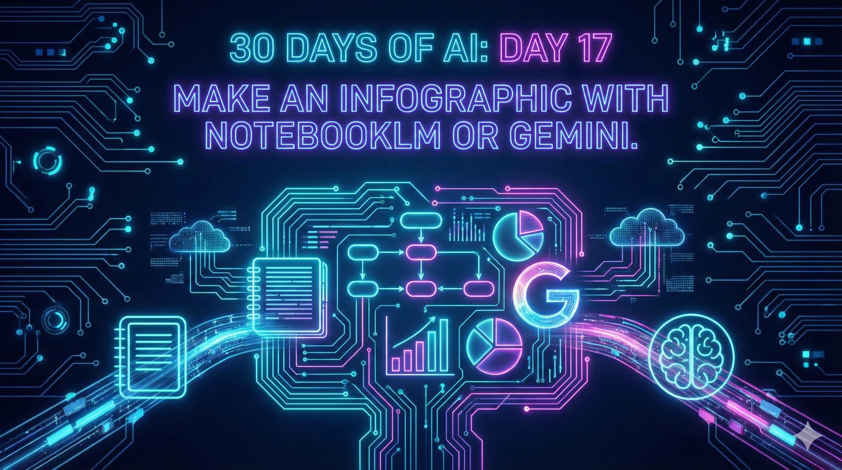
Day 17: Let's make some infographics with NotebookLM and Gemini
Now that we can get better images from AI, infographics are the next logical step.

Welcome to Day 17 of 30 Days of AI. This has been a hard lesson installment to keep under my hat—infographics. There’s so many different ways that I’ve wanted to show you infographics, and I finally kind of let the cat out of the bag with the infographic from Notebook LM on Day 15. I just had to. Creating infographics from within NotebookLM was just too cool to skip.
Yesterday I touched on infographics as one of the built-in outputs from the Studio panel in NotebookLM, but today I’m going to go into more detail on creating infographics with Gemini or NotebookLM.
What’s coming for Day 18: Creating presentations, documents, and more with Gamma (affiliate link). I’m not going to focus on too many specific tools (NotebookLM, Gamma, Antigravity, Google Workspace Studio, Google AI Studio) because I don’t want to hem you in with “this is the tool to use” too often. This is one of the exceptions because Gamma is just so amazing.
Let’s talk about infographics.
Infographics are a great way to explain complex topics. They’ve been around for a long time, John Mair is credited with coining the term and they really hit the zeitgeist with USA Today. Remember all those graphics explaining things? I remember people dismissing them as childish and “dumbing down” information. Maybe, but explaining things visually makes them easier to digest. I’m all for clear communications. If it gets the point across, cool, and leave it at that.
I like infographics, but just can’t create them from scratch
Some people can just think: I know how to visualize this as an infographic. And they fire up whatever tool they use—Photoshop, Canva, Illustrator—and they knock it out like it’s nothing. They make it look like magic. That’s not me. I love infographics, but I can’t make them from scratch. My brain, while it absorbs infographics really well, I just can’t pull them together.
I’ve lost count of the number of times someone has said “that post would make a great infographic…,” I try to make one and fail miserably. Just awful. No amount of trying with templates or tools or anything could get a good infographic out of my brain. The biggest problem for me always was—just what do I choose to show‽ That doesn’t even get to the “graphic” part—which is whole other story—I couldn’t pull the information out to even start.
Funny enough, pulling data out of a document and hitting the big points is exactly something AI is really, really good at. So it’s no surprise that AIs would be good at making infographics—well at least after Nana Banana came out.
Enter Gemini and deep research
One of the first, and most amazing, things I did with doing deep research in Gemini was creating an infographic. I’m not going say the results were awesome, but certainly cool. I find the infographics from deep research to be long on “info” and light on “graphic.” Sometimes they’re pretty long. Sometimes they didn’t have that “punch” really good infographics have, but it was pretty amazing to go: “here’s this really deep research that I did, and it’s like 25 pages. Bring out the best stuff, and bring out the things people should really know.”
The problem was at that time, the image creating models were terrible. Gemini had to be text heavy because any “image” generated would probably be pretty awful. As we all know, up until the summer of 2025 sucked you could not get any AI tool to put in text into the infographic—and that’s a big part of infographic, right?—without it hallucinating, without putting in absolute gibberish. It was pointless. Why bother even trying?
Then came the banana-rama-revolution
Then it all changed. As soon as Nano Banana came out, as soon as giving Gemini a document and saying: “make this into an infographic in this style” and it acctually worked. It was a whole new world.
For this edition, I’m going to focus on using Gemini and NotebookLM for the examples. These are the tools where I have the most experience and have gotten the most positive results. I suspect that with the image updates to ChatGPT 5.2 it’ll be able to turn out a pretty decent infographic.
Let’s make some infographics
So let’s make an infographic in Gemini. You need to give it something to work with, documents work really well, but so to links to websites, deep research reports, anything information dense will do the trick.
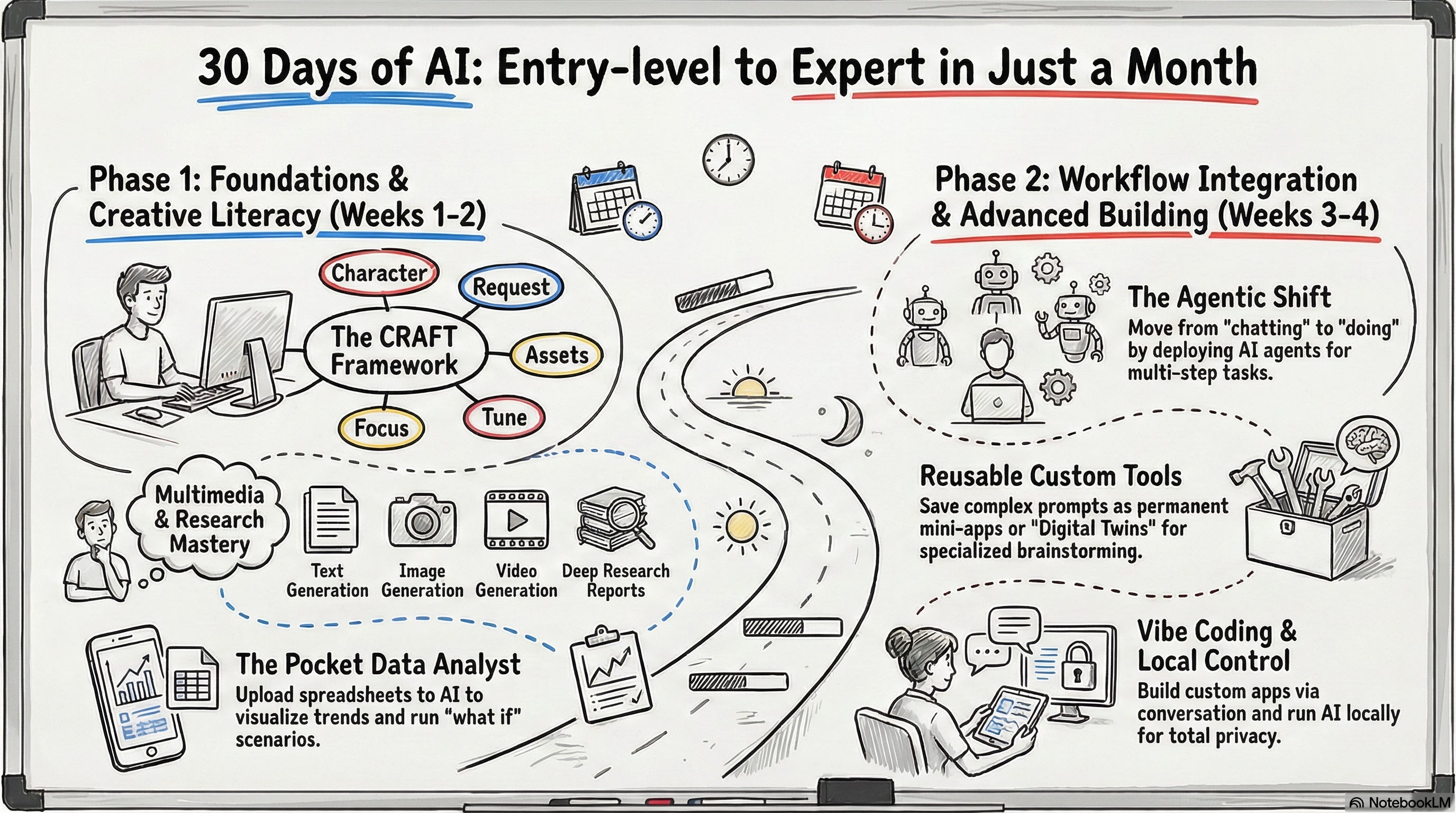
I’m using my outline for what I’m covering over the 30 Days of AI. You can use the same link to follow along. If you make an infographic from my content, please link back to 30 Plus Days of AI. We’ll start simple, fire up Gemini, put it in Thinking or Pro mode—yes, Flash might do just fine, but it might not follow any edits you want to make too well—you can click to say you’re creating an image, but I think it’s optional now, copy the prompt below and hit return.
Review this website an create a whiteboard-style infographic. Use primary colors and black. The title should be “30 Days of AI: Entry-level to Expert in Just a Month” https://30plusdaysofai.substack.com/p/what-youll-learn-over-the-30-days
Pretty simple, right? Mostly. It took a few tries in Gemini to get not only what I wanted, but to only focus on my content. Here are some of the results, none of which I’d like to use.


Python? Linear algebra? This is the real lesson here, I wasn’t specific enough. How did I fall into this trap? Easy, really. I had been creating infographics with prompts not too different than the one above and getting exactly what I wanted. Even the images in the Should I use an AI browser post were 90% there after the first prompt. What happened here? Chaos? Random cosmic rays flipping a bit? Gemini having a snack and a bit distracted? No idea.
Trying the above prompt in NotebookLM, using only that source, gave me a much better result. Even the one from Day 15 was better than what Gemini did that I showed above. One of the things I like about the infographic options in NotebookLM is giving you buttons for orientation, level of detail, and language, even before you get to the prompt part. Note: The prompt window within NotebookLM Studio custom instructions is only 5000 characters. Seems like a lot, but you’ll be surprised at how little 5000 characters is.
Here’s another NotebookLM example. I had NotebookLM use just the two deep research posts and used this prompt:
Using these two sources, create a sketched infographic on a green chalkboard. It should look like something drawn on a whiteboard to explain the main poitns from the sources. It should be a little rough, a little messy. Use only primary colors plus white on the chalkboard. The title should be: Using Deep Research to Power Insights.
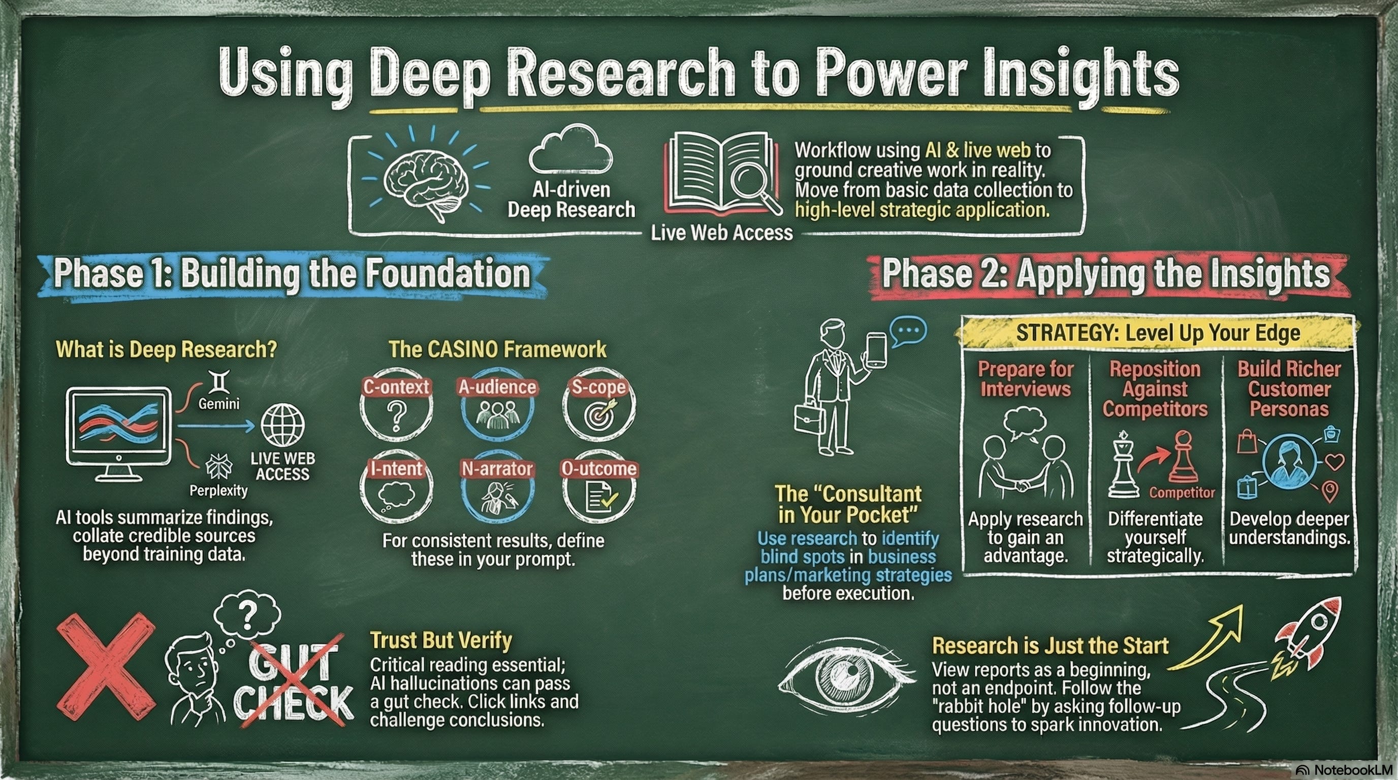
Pretty good! Thankfully it turns out like I hoped, so I didn’t have to tweak that prompt.
Can I make changes?
Yes! For my AI browsers post, each of the two infographic timelines needed a tweak or two. In Gemini it works within the same chat window and you get the iterations you’re looking for. NotebookLM, as you might have figured out, doesn’t work like that. You generate something in Studio and you either like it and keep it, or you delete it. No more kicks at the can.
Not being able to re-focus or redirect NotebookLM aside, I have been pretty happy with the output. Here’s my advice: If you have a pretty simple infographic to make, something you don’t think you’ll need to ask for changes on, NotebookLM is a good choice. If you think it’s going to be pretty complex, use Gemini.
Examples:
The infographics for what I’m covering over the 30 days of lessons and deep research—NotebookLM was perfect.
The AI browser infographic, where I needed to make sure the details were spot on—Gemini (I also wasn’t 100% sure what I wanted the final version to look like).
